
Paint Visualiser App Planning: Help Customers Choose with Confidence
TL;DR: A paint visualiser app helps people preview colours in a room before narrowing their choices. Build it around comparing options, keeping the correct shade reference and requesting a sample; use a physical sample to confirm the finish. Webbies brings app design, visualisation and development together around that customer journey.
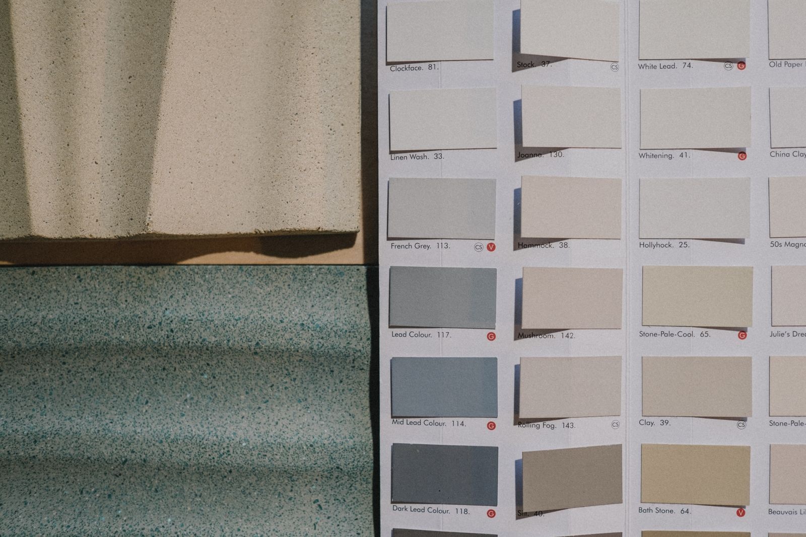
Illustrative photography by Ron Lach / Pexels.
Introduction
Your customer likes a colour on a small card, then hesitates when imagining an entire wall. A paint visualiser app can make that conversation more concrete, provided the preview leads to a practical decision rather than a screen full of effects.
The business opportunity is to help someone arrive at a better shortlist. For a paint brand, retailer or distributor, that might mean a saved palette, a sample request or a more specific conversation with a dealer. None of those outcomes should be assumed simply because the app has been downloaded.
Webbies’ Berger My Colour project combines mobile colour exploration, room previews and palettes drawn from photographs. This guide uses that documented experience as a starting point, then explains how to plan a focused product for your own customers.
What Is a Paint Visualiser App
A paint visualiser app is a digital tool that shows a selected paint colour on a room image so a customer can explore possible combinations.
Some products begin with a prepared room scene; others let people upload their own photograph. Those choices create different demands. Prepared scenes give you controlled imagery, while customer photographs introduce shadows, furniture, unusual angles and surfaces that may be difficult to separate.
The preview is one part of the purchase journey. The product also needs reliable colour names, codes and availability information. A beautiful room image becomes frustrating if the customer cannot identify the shade when visiting a shop.
Why Customers Need More Than a Colour Grid
Customers are often trying to answer several questions at once:
- Will this shade work beside the furniture I already own?
- Which of these two options should I ask to sample?
- How do I show the dealer exactly what I selected?
- Can I return to the same shortlist tomorrow?
Design around those questions. A useful preview can reduce the effort of explaining a preference, but it cannot guarantee a purchase or reproduce every real-world finish. Screen settings, room lighting, the underlying surface and paint application all affect what the final result looks like.
How to Plan a Useful Paint Preview Journey
Start with one room and a clear choice
Choose a first use case, such as comparing living-room wall colours. Let the customer select a surface, try a shade and compare the result without losing the original photograph. Keep advanced controls behind an understandable first experience.
If a wall has been selected incorrectly, offer a clear correction or a prepared scene. Do not leave the customer repeatedly uploading the same photograph with no explanation. A recoverable error is often more useful than another decorative feature.
Choose the right preview method
| Approach | Useful starting situation | What to check |
|---|---|---|
| Prepared room scenes | A small first release with consistent imagery | Whether the scenes represent customers’ spaces |
| Customer photo preview | People want to explore their own rooms | Surface selection, shadows and correction controls |
| Dealer-assisted preview | Staff support the colour conversation | Speed, shared references and sample handoff |
This is a planning comparison, not a statement that every method belongs in one app. Start with the smallest approach that helps the customer make a meaningful choice, then test whether additional flexibility is needed.
Keep product identity attached to the image
Show the shade name and code beside the preview, and preserve both in saved palettes or shared summaries. If a finish or product range matters to the next step, include it explicitly. Avoid a screenshot becoming the only record of the selection.
A comparison screen should also make clear what changed. Keep the same room angle while switching shades, and provide a straightforward way to return to the original. This helps people compare the colour rather than comparing two different presentations.
Connect the preview to a business action
Decide what happens after selection. A sample request, dealer enquiry or saved palette should carry the chosen shade references into the next conversation. Explain whether someone is making an enquiry or placing an order, and confirm what has been submitted.
Measure the full path: starting a preview, saving a shortlist and completing the intended next step. Review failed uploads and abandoned comparisons too. Downloads alone do not tell you whether the tool helped customers choose.
How Webbies can help
For Berger My Colour, the documented scope includes room previews, shade comparison and photograph-based palettes. That is relevant experience in connecting visual exploration with a mobile interface; it is not evidence of a particular sales increase.
For your business, Webbies can help define the first journey, organise the colour data, design comparison screens and develop the application. The brief should identify the image-processing approach, integrations and acceptance tests before the team estimates a full release. Explore our app development services for the wider delivery scope.
Practical Steps Before Development
- Collect real colour-selection questions from customers and dealers. Identify the decision the first release should support.
- Prepare a small, accurate shade catalogue. Include names, codes and the product information needed after previewing.
- Gather representative room photographs with permission. Include difficult examples, not only bright, empty rooms.
- Prototype selection, comparison and correction. Ask customers to complete the journey without coaching.
- Define the sample or dealer handoff. Check that every selected shade survives that transition.
- Agree on a pilot review. Compare completed journeys and support effort with the current process.
Common Mistakes to Avoid
- Presenting the preview as a guarantee of the finished paint colour.
- Showing shades without stable product codes.
- Asking for an account before a visitor can understand the tool.
- Hiding upload failures behind a loading animation.
- Launching without a named owner for catalogue updates.
Frequently Asked Questions
Can a paint visualiser app show the exact colour on my wall?
Treat it as a planning aid. Screen display, lighting and the real surface can change the appearance, so customers should confirm important choices with a physical sample.
Do we need AI for room colour visualisation?
Not for every first release. Prepared room scenes may support a useful initial experience; customer-photo workflows need a separate assessment of surface selection and correction.
How can a paint colour preview support business growth?
It can help customers express a preference and submit a more specific enquiry. Test whether saved palettes and sample requests lead to useful conversations rather than promising a fixed sales uplift.
What affects development cost and timing?
The image workflow, product data, platforms and dealer or ordering integrations affect scope. A reviewed prototype and representative photographs make an estimate more meaningful.
Can Webbies help if we already have an app?
Yes, the discussion can begin with the existing journey and its weak points. The team can assess whether improvements belong in the interface, visualisation process, catalogue or handoff.
Conclusion
A useful paint preview turns uncertainty into a shortlist that the customer can understand and share. Keep shade identity, correction and the next business action close to the visual experience. Talk to Webbies about your colour-selection journey.
Related Webbies services and projects
Sources and further reading
- W3C guidance on text alternatives for informative images supports keeping important information available beyond imagery.
Plan your project with Webbies
Bring a sample catalogue and one customer journey to Webbies to scope a practical first release.