
Case study Experiences
All case studiesVulkan Darts — Case Study
Bringing immersive visuals, multiple game modes, and intuitive navigation to the darts cabinet experience.
Overview
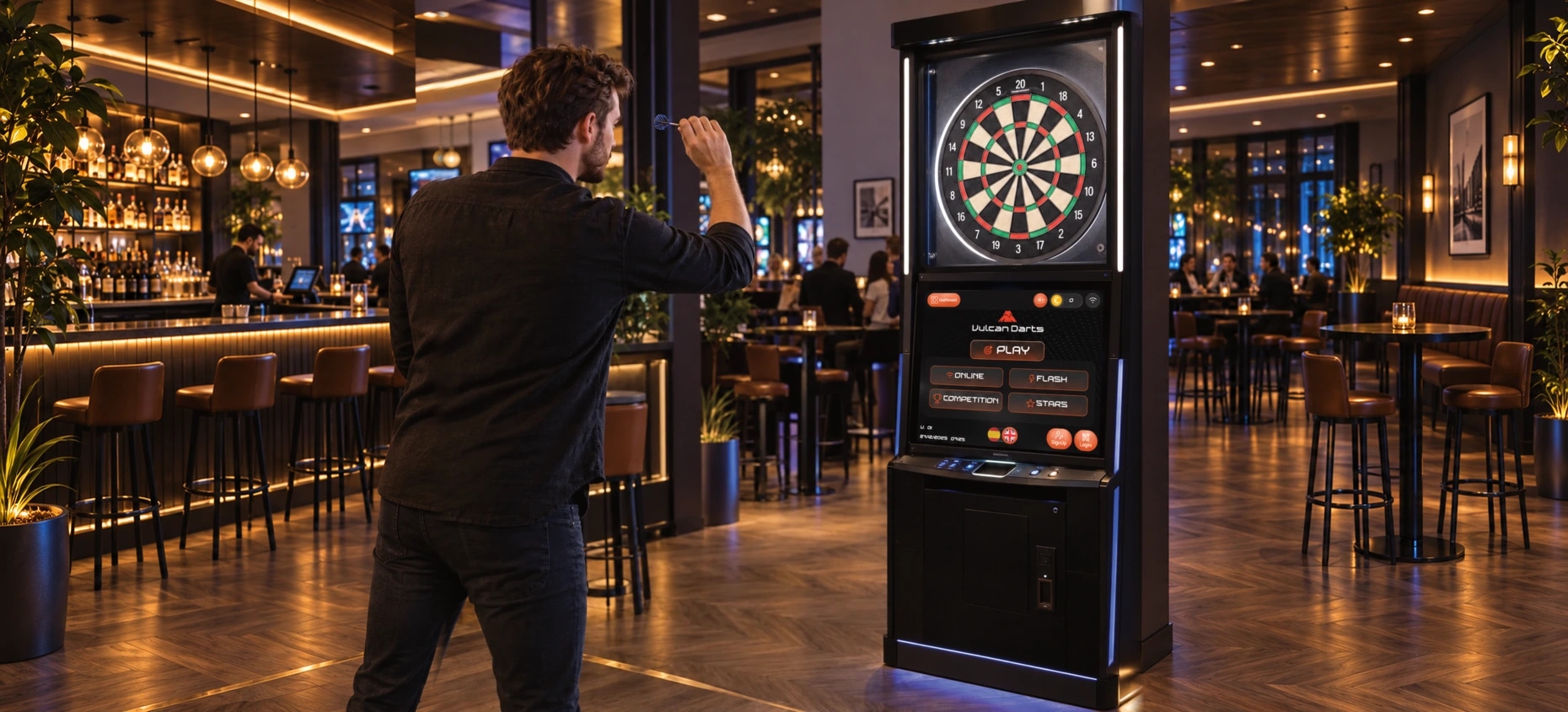
Webbies designed Vulcan Darts’ interactive darts gaming interface to combine immersive visuals, multiple game modes, and intuitive navigation. The project focuses on the digital experience players encounter as part of a physical darts setup.
Context and Challenge
A darts cabinet interface has to fit around the physical game. Players need to recognise the available modes, find the main play action and understand where account options sit without losing the focus on play.
Solution
Webbies designed a dark interface with orange accents and clear Vulcan Darts branding. A prominent Play action sits alongside visible game-mode choices, with Sign Up, Login and language-selection controls grouped separately.
The Outcome
The supplied reference shows the gaming interface integrated below the dartboard. Online, Flash, Competition and Stars are visible mode labels, supported by a clear main action and player-access controls.
The Impact
The design creates a recognisable route into the gaming experience and separates core play choices from supporting controls. Gameplay rules, backend implementation and measured player-engagement results are outside the documented scope.
Features
Immersive gaming presentation
The interface uses a dark visual foundation, bright orange controls, and prominent Vulcan Darts branding. This treatment gives the digital screen a consistent identity within the cabinet and keeps key choices visually distinct.
Multiple game-mode choices
The project brief identifies multiple interactive game modes as a core feature. The reference presents four labeled choices—Online, Flash, Competition, and Stars—in a compact selection area. Their rules, availability, and detailed behavior are not documented in the supplied material.
A clear starting point
A prominent Play action provides a recognizable entry point to the gaming experience. Its placement alongside the mode choices connects the main action with the options players can explore. The source does not show the exact sequence between selecting a mode and starting a game.
Intuitive player navigation
The screen groups the main play controls, mode choices, and additional player actions into distinct areas. This organization supports the brief’s emphasis on intuitive navigation, giving players visible destinations as they explore the interface.
Player access controls
Sign Up and Login controls appear near the bottom of the interface, alongside language-selection icons. These provide visible access points for additional player options. Account workflows, supported languages, and localization behavior are not specified.
The design brings three player needs together:
Orient: Recognize the game interface and locate its main controls.
Choose: Explore the available game-mode labels and play options.
Begin: Use the prominent Play entry point to move toward the game experience.
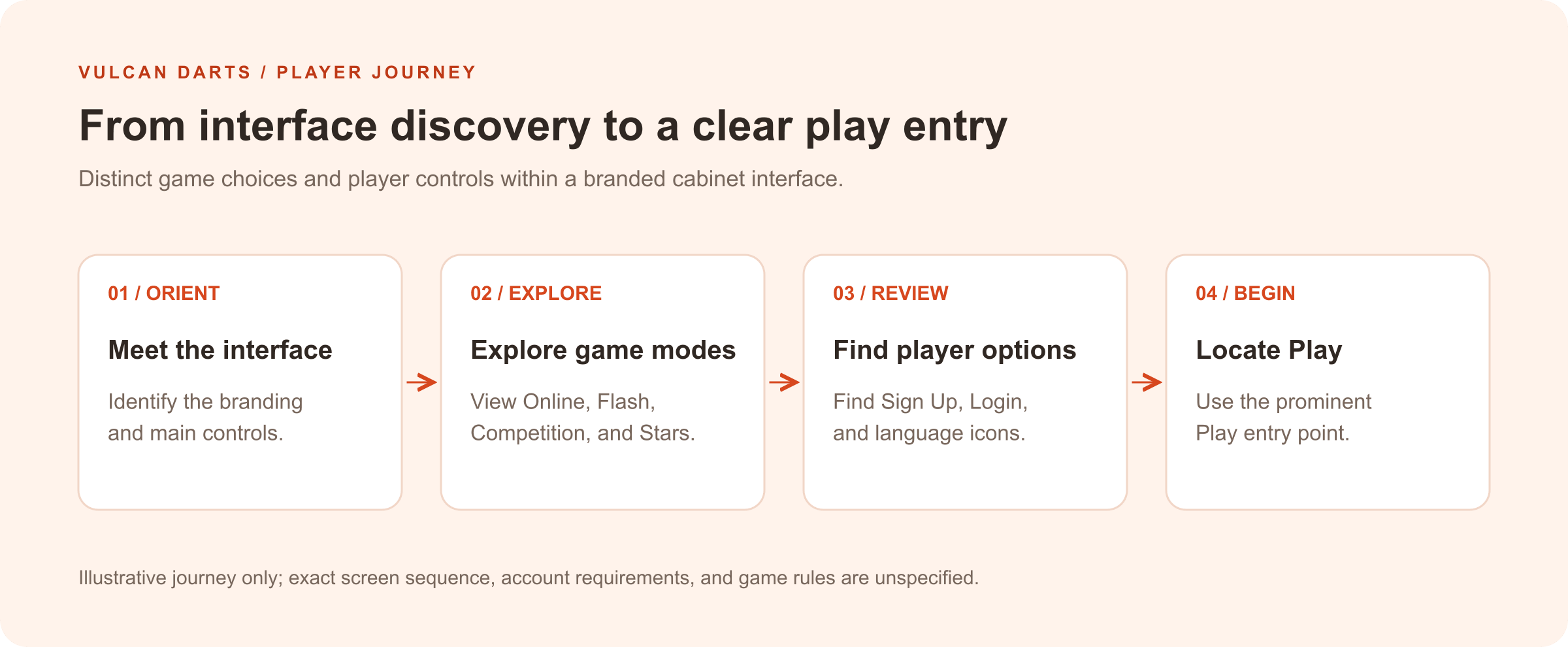
Illustrative journey based on the supplied interface and brief. It does not establish the exact screen sequence, account requirements, or gameplay rules.
Explore further
Let’s make a start
Tell us what
you have in mind.
Choose a service to start the conversation.
Continue with AI development & generative AI